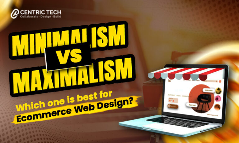
Have you ever wondered why some e-commerce websites are simple while others are bursting with colors?
If you have shopped online, you have probably noticed these two distinct styles: Minimalism vs. Maximalism in web design. But which one is better for your online store?
We are sure this is not the first time you have heard about minimalism. It is the real deal these days and a quotation applicable to all niches of life. But what does it mean to have a minimalistic e-commerce website? Our Shopify development services can help clear any confusion and set you on the road to creative ideas.
Are you ready to dive into the world of minimalism vs maximalism in e-commerce web design? Let’s explore these two captivating design ideologies and find out which one might be the perfect fit for your business.
What Is Minimalism And Maximilism? Let’s Understand The Basics
We are sure you are curious to untangle these words and apply their concepts in the creation of your website design. Before, we proceed let’s understand; what these terms mean and where your ideas fall.
Minimalism in web design is all about stripping away the unnecessary and focusing on what truly matters. Think clean lines, ample white space, and a handful of well-chosen colors.
It creates focus on the product and allows seamless navigation of the website.
According to Influencer Marketing Hub,
“Amazon had the highest sales of nearly $575 billion, out of which $278 million were generated from e-stores. They follow a simple, minimalist outlay and product-specific user interface. “
On the flip side, maximalism is all about embracing abundance and complexity. This style celebrates rich textures, vibrant colors, and intricate details. It’s like stepping into a lively bazaar full of fascinating items at every turn, each one telling its own story.
You can choose whichever, Minimalist vs maximalist user engagement better suits your style and brand story and infuse your creativity.
Also read: How Much Does It Cost to Build A Shopify Website
Understanding Minimalism in E-commerce Web Design
Are you ready to explore the benefits of each style? So you can easily weigh your options and get started with the design journey.

When comparing minimalist vs. maximalist web design, minimalism stands out for its clean, simple approach. For a minimalist web design, you need to take a deep breath and stick to less is more phenomenon.
Let’s explore what Minimalism in eCommerce design looks like…
Key Characteristics of Minimalist Design:
- Clean and Simple Layouts: Minimalist web design features streamlined layouts that are easy to navigate. The simplicity ensures that users are not overwhelmed and can quickly find what they need.
- Ample White Space: White space, or negative space, is a crucial element in minimalist design. It helps to create a sense of openness and clarity, making the content more readable and easy to understand.
- Limited Color Palette: A minimalist design typically uses a restrained color palette. This not only enhances visual coherence but also allows key elements, such as call-to-action buttons, to stand out.
- Focus on Essential Elements: By stripping away the non-essential, minimalist web design highlights the most important aspects of the website. This includes high-quality images, concise text, and clear calls-to-action.
Benefits of Minimalist Design for E-commerce:
Now that it is clear how Minimalism in eCommerce design shows up, you can easily draw a comparison between minimalist vs maximalist web design.
For your better judgment, we have also included some detailed benefits of minimalist design and how it draws traffic to your website. Not just from aesthetic aspect but also from technical point of view.
- Enhanced User Experience: With a focus on simplicity and clarity, minimalist web design makes it easy for customers to navigate your site and find what they’re looking for. This improves overall user satisfaction.
- Faster Load Times: Fewer design elements mean fewer resources to load, resulting in faster website performance. This is crucial for retaining visitors and reducing bounce rates.
- Improved Mobile Responsiveness: Minimalist designs are inherently more adaptable to different screen sizes, ensuring a consistent and user-friendly experience across all devices.
- Easier Navigation: A straightforward, uncluttered layout helps guide users through the purchasing process with minimal distractions, increasing the likelihood of conversions.
Exploring Maximalism in E-commerce Web Design
We hope you are not yet so convinced about minimalism trends. Before you make the final decision, it is important to understand the benefits of maximalist design. When considering minimalist vs. maximalist web design, maximalism offers a striking contrast with its bold and elaborate approach.
If you are certain to explore this polar opposite niche, let’s dig into the details…
Key Characteristics of Maximalist Design:
- Bold and Vibrant Colors: Maximalist web design often features a diverse and vibrant color palette. These bold colors draw attention and create a lively, dynamic atmosphere that can captivate visitors.
- Rich Textures and Patterns: Maximalist design incorporates a variety of textures and patterns to add depth and interest. These elements can make the website feel more tactile and engaging.
- Detailed and Layered Layouts: Unlike the simplicity of minimalist design, maximalist web design thrives on complexity. Layered layouts with multiple elements create a rich visual experience that encourages exploration.
- Emphasis on Visual Appeal: Maximalist websites prioritize aesthetics, often featuring elaborate graphics, detailed illustrations, and eye-catching visuals that make a strong impression.
Benefits of Maximalist Design for E-commerce:
If you are focused on individualism and keen to promote the uniqueness of the brand—maximalism should be your go-to move.
You shouldn’t bat an eye toward trendy themes and focus on creating Maximalist eCommerce web development design that stands for its experimentation and liveliness.
Here are some benefits to help you make a confident choice.
- Captivating and Memorable User Experience: The vibrant and detailed nature of maximalist web design can create a memorable browsing experience that keeps visitors coming back. It can make your website stand out in a crowded market.
- Strong Brand Identity: Maximalist design allows for more creativity and expression, helping to build a distinctive brand identity. It can convey your brand’s personality and values more vividly.
- Increased Engagement and Interaction: The rich visuals and detailed layouts of maximalist design can encourage users to spend more time exploring your site, increasing engagement and interaction with your content.
- Opportunities for Storytelling: Maximalist design provides a platform for storytelling through visuals. You can use images, patterns, and textures to narrate your brand’s story, creating a deeper connection with your audience.
Factors to Consider When Choosing Between Minimalism and Maximalism
Still, confused? Don’t panic! It is quite difficult deciding between minimalist vs. maximalist web design for your e-commerce site involves careful consideration of several key factors.
Each design approach has its strengths, and the best choice depends on your specific business needs and goals. Here are the main factors to keep in mind:
Target Audience and Demographics:
If your target audience values simplicity, efficiency, and ease of use, minimalist design is likely a better fit. Minimalist sites appeal to users who appreciate a clean, straightforward shopping experience without unnecessary distractions.
If you are going for something different, maximalist design might resonate more with audiences who are drawn to visual richness and creative expression. Younger demographics, such as millennials and Gen Z, often enjoy vibrant and interactive online experiences.
If your target market includes artistic or fashion-forward consumers, Maximalism in web design can make a strong impact.
Brand Identity and Messaging:
For brands that want to convey professionalism, sophistication, and a modern aesthetic, minimalist web design is ideal. Minimalism in eCommerce design emphasizes clarity and elegance, helping to build a sleek and upscale brand image.
This approach works well for luxury goods and tech products.
Do you require something with a more personal touch? If your brand is bold, eclectic, and vibrant, maximalist design can help you stand out.
It allows for more creativity and can communicate a dynamic and energetic brand personality. This style is suitable for brands in the fashion, entertainment, or arts industries, where visual storytelling and strong brand identity are crucial.
Product Type and Inventory Size:
Knowing your limits and is important. Minimalism is particularly effective for stores with a focused product range. If you offer a curated selection of high-quality items, a minimalist design can highlight each product effectively, ensuring that nothing gets lost in the clutter.
This approach also works well for products that require detailed descriptions and high-resolution images.
Maximalist design can be advantageous for stores with a diverse and extensive inventory. The rich visuals and detailed layouts can showcase a wide variety of products in an engaging way.
This approach is useful for e-commerce sites that rely on strong visual appeal, such as those selling home decor, fashion, or artisanal goods.
Marketing and Content Strategy:
Want to engage more audience? Then ensure that the marketing strategy focuses on content, such as blogs, product guides, and detailed descriptions, a minimalist design can provide a clean and readable platform for your content.
It helps ensure that your messaging is clear and easy to digest, which can improve user engagement and SEO performance.
If your brand that utilize bold visuals in their marketing, such as vibrant images, videos, and graphics, a Maximalist eCommerce design can enhance these elements. It offers a visually stimulating environment that can make your marketing content more compelling and memorable.
Read: An Ultimate Guide to Inclusive Web Design
Case Studies and Examples For Minimalist vs Maximalist Fashion Websites
Right, so it is enough to learn about the details and the basic layout of a minimalist and maximalist website. We hope you have grown tired of it.
Because we have some great examples to study and analyze that can inspire you and kickstart your journey in an instant.
Maybe a fully designed website can give you a complete finished look of the Web design styles comparison.
Minimalism Example:
For the Minimalism in eCommerce design we have a sophisticatly designed website of Olive Clothing. Notice that they have used very simple colors, light text, uncomplicated typography and yet very aesthetic.
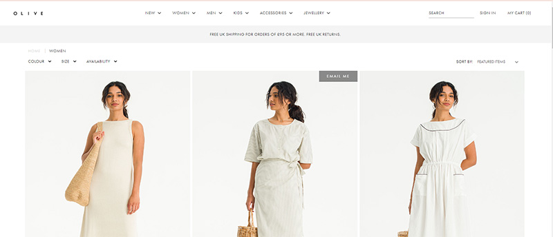
Here are some features, we will like you to focus on:
- Simple, clean white base and background
- Clean tabs with no hint of color
- Small text with simple fonts and typography
- Navigation bars are at the edges
- Mildly prominent call-to-action button
- Easy navigation from one tab to another
Maximalism Example:
If you haven’t made your mind yet, there are many fashion websites that resort to brand storytelling and unique contrast of colors and images. One such example of Maximalism in web design is Marrisa Wilson NY.
You can easily appreciate the pop of vibrant colors that shows African culture and depicts story of the brand in a very pronounced manner.
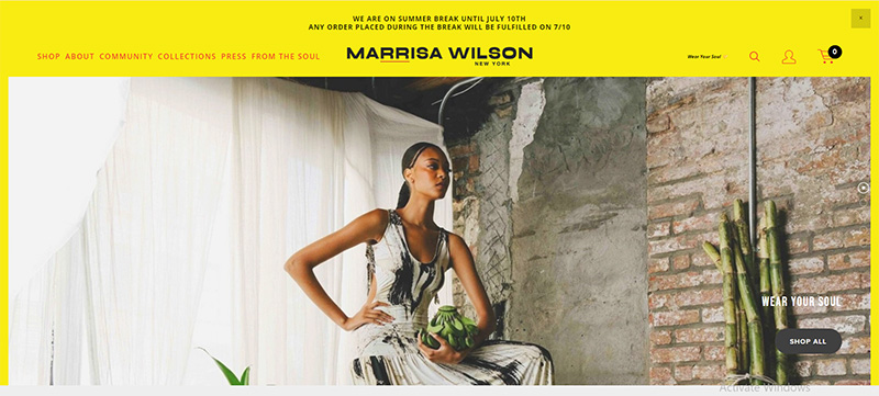
Some key features to notice here are:
- A bright and sharp colored yellow base
- Bold photography oozing with colors and different texture
- Use of bold font with mixture of smaller ones to create contrast
- Text in different colors like red and black
- Bold brand name that focuses on the identity
- Series of pictures that depict brand culture efficiently
A Mixture Of Minimalism And Maximalism
Are you still indecisive? Worry no more because we came up with a new option to settle the minimalist vs maximalist web design at once. The solution is to mix both styles in a creative manner that puts forward your brand style in a great way.
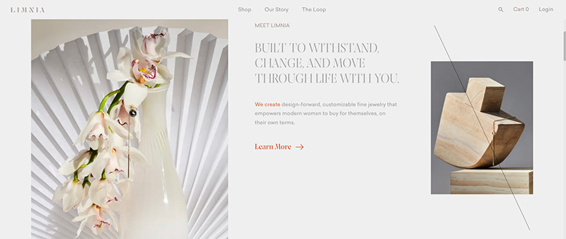
For instance, you can look at a jewelry e-commerce website called Limnia. They have a fused both style expertly and yet have a user friendly website that is easy to use, eye-pleasing, catchy but also sophisticated at the same time.
If you want a perfect dissection, focus on the following details:
- A clean base, white mixture of white and grey shades
- Photography with vibrant colors but different texture and angle
- Different lines, art and typography to make it trendy
- Mixture of typography in bold, capital and small letters
- Subtle hint of color in call-to-action tabs for easy guidance
Final Verdict
Let’s discuss the final pros and cons of minimalist vs maximalist e-commerce designs so you can make a confirm choice as we are moving towards the end:
Some benefits and drawbacks of Minimalism in eCommerce design:
Pros:
- Enhanced User Experience: Easy navigation and clean layouts.
- Faster Load Times: Quick loading due to fewer elements.
- Improved Mobile Responsiveness: Adapts well to various screen sizes.
- Focus on Content: Highlights essential elements.
- Professional Appearance: Conveys sophistication and quality.
Cons:
- Limited Visual Appeal: May appear plain or boring.
- Brand Differentiation: Harder to stand out from competitors.
- Reduced Creativity: Less room for elaborate visuals.
- Potential Underutilization of Space: Excessive white space can feel incomplete.
On the contrary, other perspective of pros and cons of Maximalism in web design:
Pros
- Captivating and Memorable: Bold and engaging user experience.
- Strong Brand Identity: Builds a distinctive brand image.
- Increased User Engagement: Encourages longer site visits.
- Storytelling Opportunities: Offers more ways to connect with customers.
Cons
- Slower Load Times: Longer load times due to complex designs.
- Overwhelming Experience: Can distract and complicate navigation.
- Challenging Mobile Adaptation: Harder to adapt to smaller screens.
- Potential for Clutter: Can become cluttered and overwhelming.
Conclusion:
In conclusion, minimalist vs maximalist web design each offer unique benefits for e-commerce websites. Minimalism excels in providing a clean, efficient, and user-friendly experience, while maximalism captivates with its bold visuals and strong brand identity. The best design approach depends on your target audience, brand identity, product range, and marketing strategy. We at Centric Tech – website design company NJ can help you carefully evaluate these factors to choose the style that aligns with your business goals and enhances your customers’ online shopping experience.
FAQs (Frequently Asked Questions)
1.How to identify minimalism?
Minimalism in web design is characterized by clean and simple layouts, ample white space, a limited color palette, and a focus on essential elements. The design is free of unnecessary clutter, prioritizing functionality and ease of navigation.
2.What is trendy in 2024, minimalism or maximalism?
In 2024, both minimalism and maximalism are trending, with each serving different market segments and brand identities. Minimalism continues to be popular for its sleek and professional appeal, especially in tech and luxury goods.
Maximalism, however, is gaining traction for its bold, vibrant, and engaging designs, particularly in fashion, arts, and creative industries.
3.What tools should I use to design a minimalist and maximalist website?
For minimalist web design, tools like Adobe XD, Figma, and Sketch are excellent for creating clean, user-friendly layouts. For maximalist web design, consider using tools like Canva, Adobe Photoshop, and Illustrator, which provide robust capabilities for creating rich visuals, intricate patterns, and vibrant graphics.